Butchard
My last semester at Emily Carr afforded me the luxury of trying my hand at type design. As a typographer who employs a panoply of typefaces every single day, it's easy to take for granted the craft and skill that goes into the development of a font.
The inspiration for the typeface came from the wood-cut sign for The Butchart Gardens in Victoria, BC. I was immediately drawn to the friendliness and celerity of its letterforms and wanted to try my hand at translating that into type.
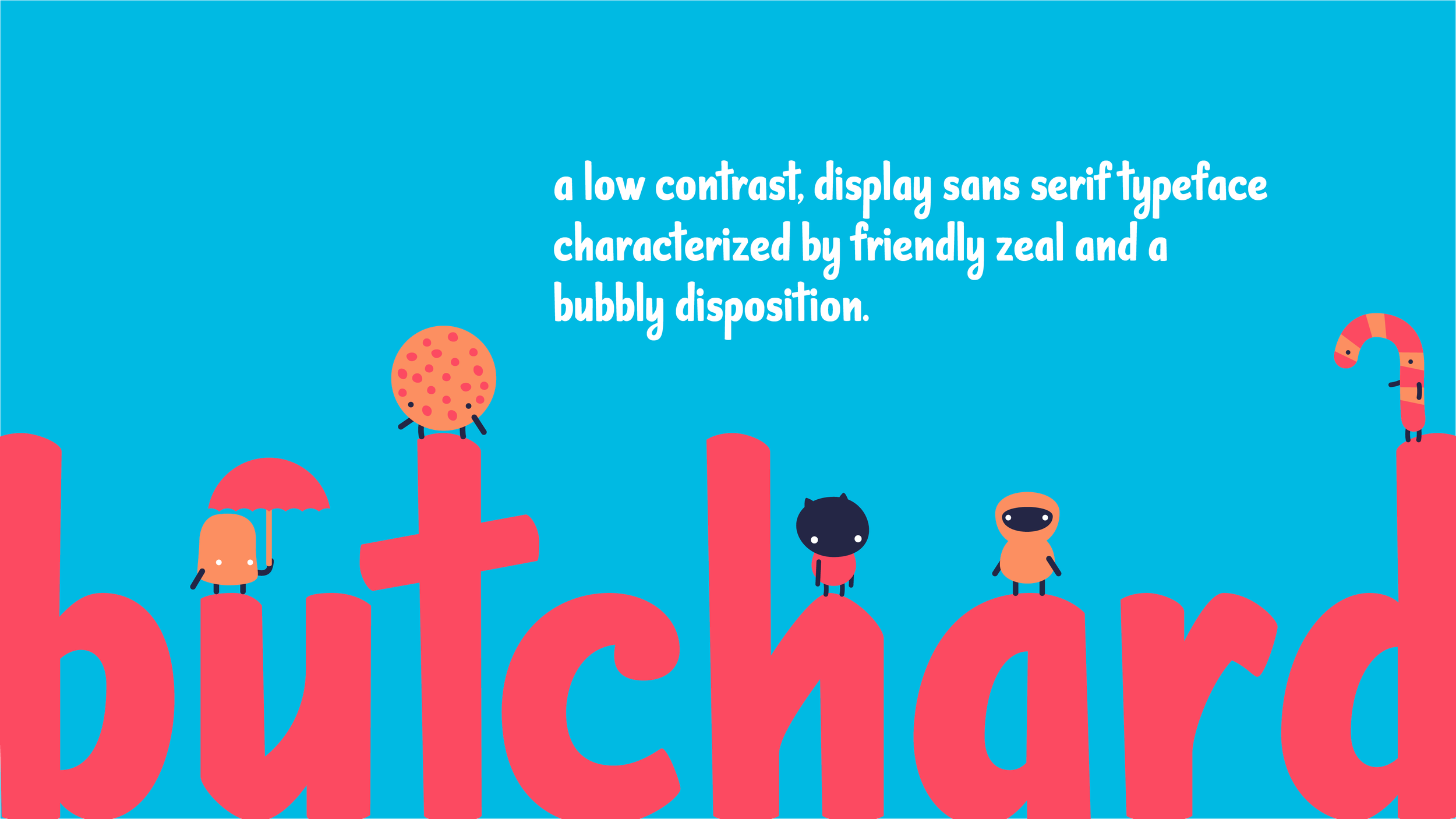
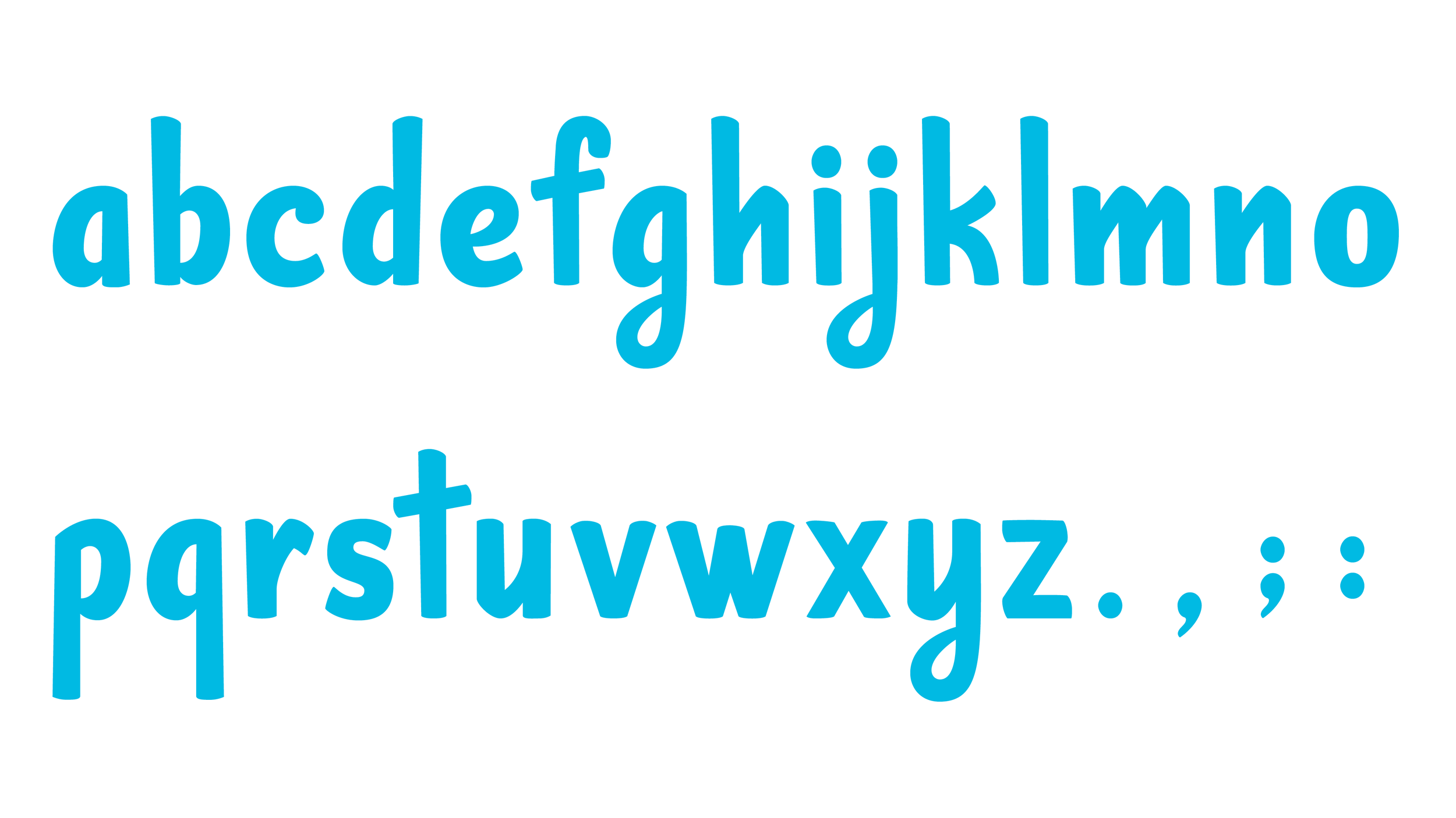
The end result is Butchard, a low-contrast, display, sans serif typeface characterized by a friendly zeal and a bubbly disposition.


